Stale blue is a blend of blue and gray tones. It offers a sense of calmness and tranquility. Slate blue is a subtle balance of cool and warm undertones.

There’s a wide range of complementary colors that go with slate blue. The color palette comprising various shades creates a refined interior, fashion, and artwork aesthetic.
The Perks and Versatility of Slate Blue
Slate blue is an appealing color in a variety of contexts. Its distinct characteristics enhance the visual appeal and create an inviting atmosphere.
- Timelessness: Slate blue has a classic and enduring quality, keeping it stylish through changing design movements.
- Adaptability: Its neutral undertones work with both cool and warm hues. Slate blue is suitable for incorporating new color palettes or creating new ones.
- Depth and sophistication: Combining cool blue and warm gray undertones adds dimension and visual interest to a design.
- Mood-enhancing properties: Slate blue’s calming and tranquil properties impact the mood and atmosphere of a space. Its soothing nature makes it a popular color option for bedrooms and living rooms.
- Versatility in design styles: Slate blue works with various designs, from modern, minimalist, traditional, and rustic. The color complements different architectural elements, textures, and materials.
- Complementary colors: The color palette is compatible with burnt sienna, thistle, coral, peach, and more.
Evolution of Slate Blue in Design and Fashion
Slate blue has a rich, evolving history with a significant impact in fashion and design.
Slate Blue’s Ancient Roots
Egyptians and Romans used natural pigments from azurite and lapis lazuli to create shades of blue. These pigments create subtle color variations when mixed with other materials or minerals. They included the grayish-blue tones of slate blue.
During the Middle Ages and the Renaissance, slate blue pigments were used to create manuscripts and oil paintings.
Industrial Revolution
There were notable advancements in synthetic pigments and dye production during the Industrial Revolution. Slate blue became more accessible and affordable. Designers and artists began experimenting with new color palettes and combinations, further popularizing slate blue.
Slate blue features in design movements like Art Deco, Mid-Century Modern, and Minimalism throughout the 20th century.
Slate Blue in Modern Fashion & Trends
Slate blue is a staple clothing color.
With sustainability and eco-friendly practices gaining traction, designers use natural pigments to create slate blue hues. Digital technology allows for more accurate color matching and reproduction.
Shades of Slate Blue: Color Codes and Variations

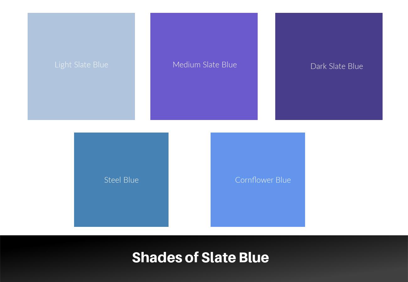
Each shade has unique characteristics. The shades vary depending on the pigments and materials used.
Read more : What Is Carbonator
ShadeHex CodeCMYKRGBLight Slate Blue#B0C4DE(30, 11, 0, 12)(176, 196, 222)Medium Slate Blue#6A5ACD(67, 56, 0, 19)(106, 90, 205)Dark Slate Blue#483D8B(65, 56, 0, 45)(72, 61, 139)Steel Blue#4682B4(69, 34, 0, 29)(70, 130, 180)Cornflower Blue#6495ED(63, 25, 0, 7)(100, 149, 237)
Lighting conditions and display settings may also lead to variations in these shades.
Colors That Go with Slate Blue
Slate blue pairs with a variety of complementary and contrasting shades. These shades create harmonious schemes for design applications.
ShadeHex CodeCMYKRGBPeach#FFDAB9(0, 15, 21, 0)(255, 218, 185)Coral#FF7F50(0, 50, 67, 0)(255, 127, 80)Burnt Sienna#E97451(0, 57, 66, 9)(233, 116, 81)Pale Goldenrod#EEE8AA(6, 0, 31, 7)(238, 232, 170)Light Salmon#FFA07A(0, 30, 50, 0)(255, 160, 122)Thistle#D8BFD8(9, 19, 0, 16)(216, 191, 216)Medium Aquamarine#66CDAA(70, 0, 33, 20)(102, 205, 170)Indian Red#CD5C5C(0, 53, 53, 20)(205, 92, 92)
Complementary, Analogous, and Triadic Colors for Slate Blue
A color wheel is an important tool that interior designers use to pair colors. Through color theory, designers discover the relationship between colors.
Complementary Color Schemes
Umber, a dark brown, is complementary to the color slate blue. It’s located opposite slate blue on the color wheel. Combining both colors creates a high contrast.
Vibrant greens also contrast with muted, cool tones of slate blue. The gray-blue color provides visual balance and appeal to the palette.
ShadeHex CodeCMYKRGBSlate Blue#6A5ACD(67, 56, 0, 19)(106, 90, 205)Umber#644E44(0, 0.22, 0.32, 0.61)(100, 78, 68)
Analogous Color Schemes
An analogous color scheme comprises colors that are adjacent to each other on the color wheel. The colors next to slate blue are blue-green (or teal) on one side and blue-violet (or lavender) on the other. Using the three analogous colors creates a cohesive design.
ShadeHex CodeCMYKRGBSlate Blue#6A5ACD(67, 56, 0, 19)(106, 90, 205)Teal#008080(1, 0, 0, 0.5)(0,128,128)Lavender#E6E6FA(8, 8, 0, 2)(90.2, 90.2, 98)
Triadic Color Schemes
A triadic color scheme combines one dominant color and two other complementary colors. The two colors that form a triad with slate blue are red-orange and yellow-green (chartreuse).
ShadeHex CodeCMYKRGBSlate Blue#6A5ACD(67, 56, 0, 19)(106, 90, 205)Red-orange#FF5349(0, 67, 71, 0)(255, 83, 73)Chartreuse#DFFF00(0.13, 0, 1, 0)(223, 255, 0)
Creating a Slate Blue Color Palette
A color palette with slate blue as the dominant color is cohesive and harmonious.
Choosing Harmonious Colors
Read more : What Holiday Is Monday September 25th
Harmonious colors to slate blue create a balanced and cohesive color palette. You can choose monochromatic slate blue colors, including shades and tints. Use slate blue as the base color and add lighter and darker shades of blue for a monochromatic color scheme.
Balancing Tones and Contrast
Limit the colors contrasting with slate blue, such as warm oranges or reds. Avoid adding more than three complementary colors, which can create visual chaos.
Place the colors next to each other and adjust the tones as necessary. Neutral colors like white, gray, or beige balance the intensity while maintaining a cohesive look.
How to Mix Slate Blue Paint
The specific shades and ratio may vary depending on the brand and type of paint. Since mixing paint colors is experimental, adjust your mixtures to achieve the perfect shade.
1. Gather Your Materials
You’ll need the following materials:
- White paint (consider titanium white)
- Blue paint (ultramarine blue or cobalt blue)
- Gray paint (neutral gray)
- Black paint (ivory black or Mars black)
- A palette or mixing surface
- Palette knife or spatula for mixing
- A paintbrush or color swatch for testing
2. Start With a Base of Blue Paint
Squeeze a sizable amount of blue paint onto your palette. It helps build a foundation for your slate blue color.
3. Add a Touch of Gray
Add a small amount of gray paint to the blue. The paint helps achieve the muted, desaturated quality of slate blue. Mix the two colors with your palette knife or spatula. The resulting color should be more subdued than the original blue.
4. Test the Color
Test the color on a paintbrush or color swatch to check whether it’s the shade you’re looking to achieve. Add more gray paint to mute the hue if the color is too bright.
5. Lighten the Mixture With White Paint
Add a small amount of white paint to the mixture for a lighter shade. Mix it thoroughly and test the color again. Add small portions of white paint until you reach the desired shade of slate blue.
6. Darken the Mixture With Black Paint (Optional)
Add a small amount of black paint if you prefer a darker shade of slate blue. Add black paint in small increments, as too much of it could overwhelm the shade.
7. Adjust as Necessary
Make extra adjustments by adding more blue, white, gray, or black paint as needed.
Blue-Gray Paint Shades: Top Picks
ShadeHex CodeCMYKRGBBenjamin Moore 1648 Slate Blue#9BB1BB(17.1, 5.3, 0, 26.7)(155, 177, 187)Sherwin Williams Storm Cloud#7A848D(13, 6, 0, 45)(122, 132, 141)Sherwin Williams Krypton#B8C0C3(6, 2, 0, 24)(184, 192, 195)Benjamin Moore Vermont Slate#4C636E(30.9, 10, 0, 56.9)(76, 99, 110)
Slate paint color is popular in modern homes for exterior and interior applications. Its cool tones are ideal for bathrooms, bedrooms, and home office spaces. Sherwin Williams and Benjamin Moore stock the paint color in various shades.
Source: https://t-tees.com
Category: WHAT
